The Evolution of Toyota graphics: A Visual Journey Through Brand Identity
Toyota, a global automotive giant, has cultivated a powerful and recognizable brand identity over decades. A significant part of this identity is communicated through its graphics, encompassing everything from the iconic logo to the visual language used in marketing materials, vehicle design, and even internal communications. This article explores the evolution of Toyota’s graphics, examining how they have contributed to the company’s success and reflecting the changing times.
The Genesis of the Toyota Logo: From Humble Beginnings to Global Icon
The Toyota logo, a seemingly simple yet profoundly symbolic design, has undergone several transformations since its inception. The earliest iterations were far removed from the sleek and modern emblem we recognize today. Initially, the company’s name was represented more literally, often incorporating the family name “Toyoda” (the company’s original name) in stylized lettering. These early logos were often more ornate and less focused on minimalist design.

The Shift to “Toyota”: A Name Change and a New Visual Direction
The transition from “Toyoda” to “Toyota” was a pivotal moment, not just for the company name, but also for its visual identity. The change was more than just a phonetic adjustment; it represented a move towards a more globally appealing and easily pronounceable name. This shift also paved the way for a more streamlined and modern logo, reflecting the company’s ambition to expand beyond its domestic market.
The Three Interlocking Ovals: Unveiling the Symbolism
The current Toyota logo, introduced in 1989, is composed of three interlocking ovals. While appearing simple at first glance, the logo is rich in symbolism. Each oval represents different aspects of the company and its relationship with its customers.

Color Palette: A Reflection of Values
The choice of color is crucial in brand identity, and Toyota’s use of color has evolved over time. While the primary logo often appears in silver or gray, conveying a sense of sophistication and quality, other colors are used in different contexts.
Typography: A Consistent Voice
The typography used by Toyota plays a crucial role in maintaining a consistent brand voice. The fonts chosen for marketing materials, brochures, and even vehicle badging are carefully selected to reflect the brand’s personality. Clean, modern sans-serif fonts are often preferred, conveying a sense of efficiency, innovation, and reliability.
Beyond the Logo: Visual Language in Marketing and Advertising
Toyota’s graphic identity extends far beyond its logo. The visual language used in its marketing and advertising campaigns is carefully crafted to resonate with target audiences and reinforce the brand’s core values. This includes the use of photography, illustration, and graphic design elements.
Graphics in Vehicle Design: A Fusion of Form and Function
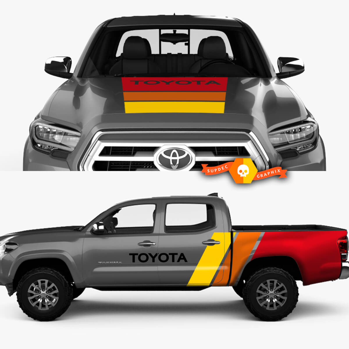
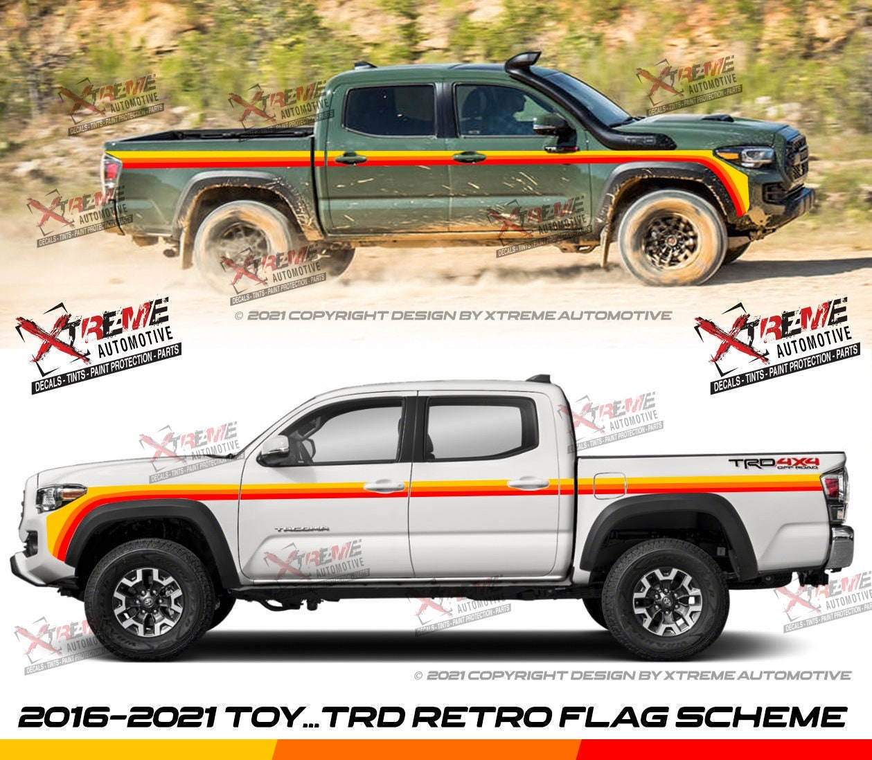
Graphics also play a role in the design of Toyota vehicles themselves. From the subtle curves and lines of the bodywork to the design of the instrument panel and interior, every element contributes to the overall aesthetic and user experience.
The Digital Age: Adapting to New Platforms
With the rise of digital media, Toyota has adapted its graphic identity to suit new platforms and technologies. The company has embraced digital design principles, creating visually engaging content for websites, social media, and mobile apps.
The Future of Toyota Graphics: Embracing Innovation
As technology continues to evolve, Toyota’s graphics will undoubtedly continue to adapt and innovate. The company is likely to explore new ways to communicate its brand message through emerging technologies such as virtual reality, augmented reality, and artificial intelligence. The focus will remain on creating visually compelling and engaging experiences that resonate with customers and reinforce the brand’s core values.
Conclusion: A Visual Legacy of Excellence
Toyota’s graphic identity has played a crucial role in the company’s success. From the iconic logo to the visual language used in marketing and vehicle design, every element contributes to the brand’s powerful and recognizable image. By consistently evolving and adapting its graphics to reflect the changing times, Toyota has built a visual legacy of excellence that will continue to resonate with customers for generations to come.
toyota graphics
